|
Client: Martin Williams, for Pfizer. 2007. Typeface consulting and font modification.
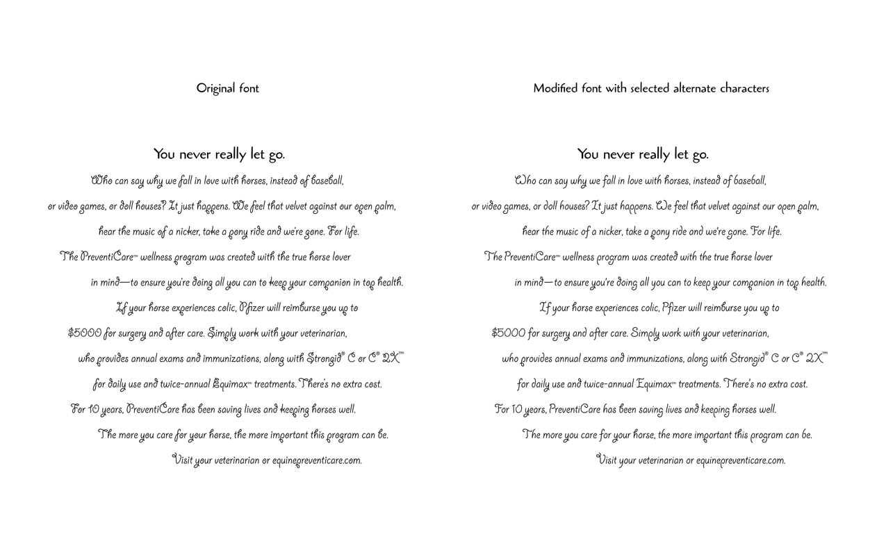
Adobe’s whimsical Giddyup typeface was chosen by the project’s designer to convey the mood desired for a series
I was called in to suggest possible fixes and to implement the chosen solution: modifying selected characters
(There’s more below the picture.) |
And here’s an example of the typographic reasoning and refinement that was applied just to the
double and single quote marks. I originally presented this as a dialogue, set in a test version
of the font, with lots of quotes and apostrophes to illustrate the issues.
“Here’s a setting with quote marks and a revised apostrophe”, he said with a winning smile.
“I’ve changed the angle on the ’poz, rotating it as you specified.”
“Why, that’s wonderful! Pfizer’s pfeople—I mean people—won’t be able to resist it!”
“I’ve also done a version with longer quotes.” Nodding sagely, he said, “The problem may be
that this font’s original quotes just aren’t long enough to have any readily visible shape.”
“Perhaps you’ve got it—a stubby little monoline hot dog with a curve in it can’t carry the
variation that gives a serif face’s bulb-and-tail quotes their shape.”
“And even Futura’s ‘wedge’ quotes, for example, show their variation more clearly,
since the simple shape makes the variation in width easier to see.”
“They’re also almost twice as long as Giddyup’s, in proportion to cap height.”
“I haven’t lengthened the Giddyup quotes nearly that much. I think that’d make them too
prominent for a face like Giddyup—perhaps because, floating above the letters, they’d interrupt
the ‘flow’ of the letterforms, a consideration that doesn’t apply to a standard text face.
As long as they’re long enough for their angle to be readily visible, that’ll probably be enough.
The smaller quotes may be fine too. I just thought it might be worthwhile showing a longer version.”